Ready to design your brand?
Logo Design is the process of creating (or recreating) your brand's unique identifer. Your Logo is your first point of contact with any customer. It is your chance to grab the attention of your audience. It is the very first step when starting or even rebranding a company.
Our Process
Concepts sketched. Is yours next?
0
+
Understand your business
Before we begin, we under your business and purpose so we can determine the emotional motivators that will influence your customers
Research the market
Here we review the competition and observe what works for your industry to get inspiration. In this phase, we get a feel for what your successful competitors look like and what artwork this industry responds to.
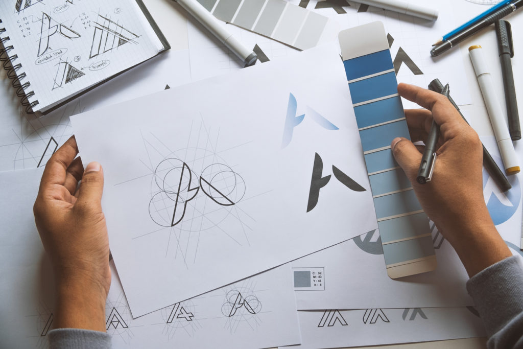
Sketch of Concepts
We get down with Pencil and Paper and sketch over 50+ rough ideas
Digitize concepts
We narrow down the sketches to a handful of options and bring those onto the computer
Refine and Present
Here we finalize and present 4 concepts along with creative reasoning for each concept
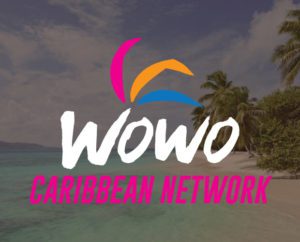
Case Example: Wowo Caribbean Network
Wowo Caribbean Network is a major caribbean media affiliate, cable network and broadcast company. They approached DDN for a logo design that represented their brand and speaks to their audience. See the below concepts we came up with to better understand our process and design methodology.
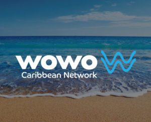
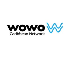
Concept 1
Concept 1
This logo option uses a san-serif font of equal height, paired and complimented by an icon. The icon is an outline of the edge of the ocean as it washes up on shore. The icon also doubles as two W’s stacked on top each other.
This logo option has a font style of a seamless connection, best for the flow of information. A palm tree sits on top as an icon with a digital effect accompanied by a tropical gradient.
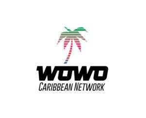
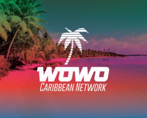
Concept 2
This logo option has a font style of a seamless connection, best for the flow of information. A palm tree sits on top as an icon with a digital effect accompanied by a tropical gradient.
Concept 3
This logo option uses a san-serif font of thin width and rounded edges to create a soft, but sturdy look. The two arcs above the second O symbolize the broadcasting that encompasses the world today. A tropical orange is used to compliment the light blue used by the main typeface.
Concept 3
This logo option uses a san-serif font of thin width and rounded edges to create a soft, but sturdy look. The two arcs above the second O symbolize the broadcasting that encompasses the world today. A tropical orange is used to compliment the light blue used by the main typeface.
This logo option uses a geometric sans-serif font on top of four over-lapping circles. The geometric style of the logo is a representation of the symbolism and nature used in the network creation environment. The circles use bright tropical colors to portray the relationship to the Caribbean and the connection to the entire world which compliments their slogan, “One World, One Caribbean”.
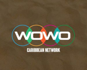
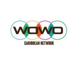
Concept 4
This logo option uses a geometric sans-serif font on top of four over-lapping circles. The geometric style of the logo is a representation of the symbolism and nature used in the network creation environment. The circles use bright tropical colors to portray the relationship to the Caribbean and the connection to the entire world which compliments their slogan, “One World, One Caribbean”.
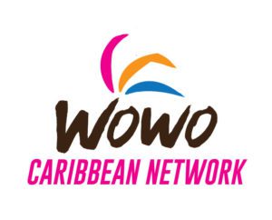
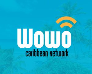
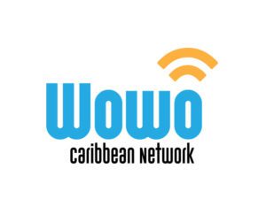
Final Choice
Wowo’s team chose this option that incorporates an organic typeface similar to writing in the sand, allowing for a playful and laidback vibe. Three shapes above represent the branches of a palm tree and are colored bright pink, orange and blue to include all areas of the Caribbean.
Final Choice